How to Create a Cover Slide for Your Pitch Deck
A cover slide is your pitch deck's first impression. Learn how to create one that grabs attention and sets the stage for a compelling pitch.
Ever wonder what it feels like to walk into a pitch meeting and say, "My cover slide is like a blind date—either it hooks you or it doesn't!" Well, let's make sure it hooks them! A cover slide is essentially the first impression of your pitch deck, and it's crucial for grabbing attention and enticing your audience to keep listening. It's not just about aesthetics; it's about conveying the essence of your brand and what makes it unique. So, let's dive into why this slide matters and how to create one that leaves a lasting impact.
Why is the Cover Slide Important
The cover slide is your startup's first impression to potential investors. It should display your company name and give a hint about what your startup does. This is also a chance to sneak in your problem or solution, setting the stage for the rest of your pitch. By doing this, you can evoke the interest of your audience and make them curious about what you have to offer.
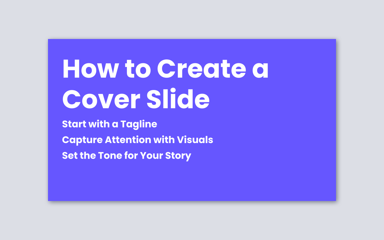
How to Create a Cover Slide
Start with a Tagline
Ensure your tagline is concise and communicates the essence of your brand. This helps immediately convey your mission or unique value proposition to potential investors. A good tagline should be memorable and leave a lasting impression, making your audience eager to learn more. Steve Blank suggests a simple formula for a clear value proposition: "We help X do Y by doing Z." X is your target customer, Y is the need you address, and Z is how you uniquely solve it. This helps startups explain their value quickly and clearly.
Capture Attention with Visuals
Use high-quality photos or graphics that resonate with your brand and message. By selecting visuals that are both relevant and impactful, you can create a memorable first impression that draws viewers into your pitch. This visual element sets the tone for your presentation and helps keep your audience engaged.
Set the Tone for Your Story
Use the cover slide to introduce the theme or narrative of your pitch. By setting the tone effectively, you can create anticipation and curiosity, making your audience more engaged and receptive to the rest of your presentation. This is your chance to frame the story you're about to tell and make it compelling.
"The cover/title slide should include the company name and the founder’s contact info; a tagline on the company is a great idea as well. Make sure to make an impression, deliver it with passion. You are in sell mode here. You’re pitching investors." as Kruze Consulting once said on Best 10+ VC Pitch Decks. Your pitch deck’s first impression—through the cover slide—is crucial for capturing investor attention, clearly communicating your startup’s identity and value, and setting a confident, passionate tone that encourages investors to engage and consider funding.
Mistakes to Avoid
Overcrowding with Information
Avoid cramming too much text or too many visuals onto your cover slide. Keep it simple and focused on key elements like your company name, logo, and a compelling tagline. This helps maintain clarity and ensures your message isn't lost in clutter. Here are two examples:
- Bad Example: A cover slide with a lengthy paragraph describing your company history, mission, and product details. This overwhelms the viewer and fails to create a clear first impression.
- Good Example: A clean cover slide featuring your company logo, a concise tagline, and a relevant image. This approach is straightforward and engaging, making it easy for viewers to grasp your brand identity at a glance.
Poor Design Choices
Steer clear of inconsistent or unprofessional design elements such as mismatched fonts, colors, or low-quality images. Ensure your cover slide reflects your brand identity and sets a positive tone for the rest of your presentation. Here are two examples:
- Bad Example: Using a bright red font on a blue background with a pixelated logo. This combination is jarring and unprofessional, which can deter potential investors.
- Good Example: Consistently using your brand colors and fonts across the slide, with a high-quality logo and image. This creates a cohesive look that aligns with your brand's style guide.
Lack of Impactful Visuals
Don't use bland or irrelevant images that fail to capture attention. Instead, choose high-quality visuals that resonate with your brand and message, helping to create a memorable first impression. Here are two examples:
- Bad Example: Using a generic stock photo that doesn't relate to your business or industry. This can make your pitch seem unoriginal and less engaging.
- Good Example: Incorporating a custom-designed graphic or photo that directly represents your product or service. This adds a personal touch and makes your pitch more memorable.
Frequently Asked Questions
What must a cover slide contain?
Company name, logo, tagline (one-liner explaining your business), and contact details. It’s your handshake keep it memorable and clear.
Should I include visual elements?
Yes! A well-designed, simple visual helps create instant impact and sets the tone for the rest of your presentation.
Can I add a quick elevator pitch on the cover slide?
Include a concise value statement (5-7 words) explaining what your company does make sure investors “get it” right away.
The Short of It
A strong cover slide is crucial because a great cover slide sets the tone for your entire pitch deck and sparks investor interest from the start. It’s your first chance to make a memorable impression, share your brand’s story, and show why your startup matters. If your cover slide misses the mark, you might lose their attention before you even begin. By keeping it simple, clear, and visually engaging, you invite investors to want to learn more about you. Ready to create a cover slide that truly stands out? Start with our professional pitch deck template designed to help you make that powerful first impression with ease.

Get a Professional Pitch Deck and Tell Compelling Stories
✓ Unique layouts ✓ Editable elements ✓ Free vector icons ✓ Compatible with Google Slides
Download now →